Thursday, December 13, 2012

Notebooks !!!

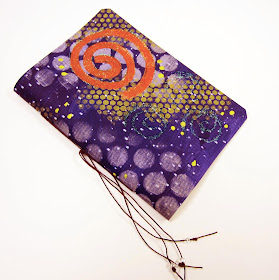
I was recently given a large roll of heavy vinyl used in the manufacturing of commercial banners and signs.  One side has a nice texture for painting and the other side is smooth. 
It didn't take long to discover that this material was perfect for making durable little notebook covers that could be easily painted and embellished with acrylic paints.
Pictured here are some of the results.
 
This one was painted with a background color and then I used circular stencils in various sizes to layer pattern on the surface.   A simple pamphlet stitch binds the single signature book.


 Similar techniques were used here, but I also used a patterned roller to remove paint in areas for additional texture.
This one was painted and then a sheet of bubble wrap was pressed into the wet paint for effect. 

Saturday, October 6, 2012

Alcohol Ink and Sea Salt

   Fun with alcohol ink continues.  Here is a picture of one of my recent journals using the papers to cover my book boards.
  In this example, I saturated the surface of heavy watercolor paper with alcohol ink, sprinkled on sea salt and walked away.   The next day, after brushing off all the salt, this is what the paper looked like.   Alchemy !
   Each time I use this process I am amazed at the beautiful results.
 I have also recently discovered a wonderful binding product to use for the spine....
it is called Eco Leather.  This product is not actual leather, but has the durability and feel of leather.

Friday, September 21, 2012

Alcohol Inks

 A while back I experimented with making my own alcohol inks using dye and alcohol.   I used the inks to saturate some heavy watercolor paper and really liked the resulting mottled appearance.  
Here is one of my handmade visual journals using that paper to cover the bookboards.
If you use alcohol inks, be very careful and wear protective gloves as it is staining and permanent on your hands and everything else.   All surfaces should be protected.

Tuesday, September 11, 2012

Zentangle Mandalas

 I am teaching my drawing students how to design mandalas and fill them with zentangle patterns.  As usual, I enjoy making examples of the project too.  Here are some that I have completed using pen and graphite.
 With the exception of the circle, which is traced from a cut paper template, everything else is drawn freehand.   The beauty of this method is that you learn to use spatial judgement as you map out the pattern areas, turning the paper and repeating elements as you develop the symmetrical design.
Anything is possible, one pen stroke at a time.

Saturday, July 28, 2012

Welcome to the Machine

 The Theme for our Artist Trading Card (ATC) group this month is Machine.  
Having recently returned from Valley Ridge Art Studio where I took a class from artist Michael deMeng, my machine themed ATCs are a tribute to this artist and his wonderful teaching style.
  Both of these ATC designs are created digitally on Photoshop using 8-10 individual images.
The advantage of working digitally is that individual elements can be altered and arranged in layers and there are virtually unlimited possibilities for composition.
Almost anything you imagine is possible to illustrate.

Saturday, June 30, 2012

Pale Writer

  Pun intended... I just couldn't help it.
  This journal started with the hand painted cover paper.   I used a durable heavy weight stock, and rolled it out onto my work table.  Layers of paint were applied in the chosen colors, and when dry, that was randomly printed with stamps and stencils.  
  This is my favorite method for producing unique looking cover papers, which are then cut and applied to book board.
    The spine on this particular book is made from heavy artist quality canvas that has been painted and distressed.  I like the way it reminds me of weathered wood.
    Next, the spine is attached to the book covers, and the signatures of pages are bound in place.
    After the binding, which in this case is exposed longstitch,  holes are drilled into the heavy covers for the centipede stitch embellishments.  I think of them as the guardians of whatever content the new owner chooses to add to the book.... I promise they won't bite.
 

Tuesday, June 26, 2012

Nature's Architects


  This month the theme for our ATCs was "Architecture."  My thoughts turned immediately to the architects of nature, and in particular, insects.   
  One side of my card shows the outside of the nest and it's architects, while the other side features the elaborate interior with it's rows and layers of little chambers.  
Although we would not want these nests in or near our own living spaces, I would hope that we honor and give space to them in their natural surroundings.  
  My "architecture" card was designed using Photoshop.  

Saturday, May 12, 2012

Centipedes Again


Centipedes are once again making an appearance on my journal covers.
They are so fun to make that sometimes I just can't resist.  

I use waxed linen to stitch them into pre-drilled holes in the book covers.
This book and others (with and without centipedes) are available online in my Etsy shop.

Friday, April 6, 2012

Myth

What if all myths were true?
This is a page from my visual journal that I used in the ATC exchange this month.  

"I believe that imagination is stronger than knowledge, myth is more potent than history, dreams are more powerful than facts, hope always triumphs over experience, laughter is the cure for grief and love is stronger than death."  ~Robert Fulghum


Thursday, February 9, 2012

Anatomy Lesson


This month's theme, Anatomy Lesson, was inspired by old biology books and the transparent pages that allow you to see through multiple layers of the body.
This ATC is constructed in book format and opens up to show the important "inner works."
Ten individual images from Deviant Scrap, were downloaded, arranged and altered in photoshop layers to create these compositions.

Thursday, January 19, 2012

Wonder Now

This month's ATC.... a Wild Card.   Individual images from Tumblefish Studios, altered and assembled by yours truly in photoshop.   7 layers of imagery in all.
Wonder Now.